
American Red Cross
Reimagining the American Red Cross Volunteer Connections page to streamline navigation and boost volunteer engagement
PROJECT TYPE
Class Project — COGS 127 Data Driven UX/Product Design
ROLE
UI/UX Designer
TIMELINE
January - March 2025 (10 weeks)
TEAM
4 UX Designers

Project Overview
What is American Red Cross?
The American Red Cross (ARC) is a non-profit organization that provides emergency assistance, disaster relief, and disaster preparedness education and is part of the global Red Cross and Red Crescent movement.
Within American Red Cross is a volunteer connections portal that facilitates tasks essential to volunteering, including organizing events, managing volunteer hours, and fostering collaboration across different Red Cross chapters, clubs, and committees.
This case study is a redesign of the American Red Cross Volunteers Connections portal for a data-driven UX/Product Design course.
Background / Project Context
Why did our team choose this project?
Our team’s idea for this project was inspired by a shared interest for making impactful tools in healthcare and education more accessible. One of our team members has worked extensively with the Volunteer Connection portal while serving as a co-president at their high school’s American Red Cross club and found several aspects of the interface to be overwhelming and unintuitive.
What is the goal?
Our goal was to improve the American Red Cross Volunteer portal to develop an efficient way for volunteers to log, track, and manage their service hours.
Problem
American Red Cross volunteers need a more intuitive and efficient way to log, track, and manage their service hours — How might we make this process feel effortless and rewarding while ensuring their impact is accurately recognized?
Solution
A sneak peek into our final solution!
Research
Stakeholder Interviews
I conducted interviews with 2 American Red Cross staff coordinators for about 30 minutes each and we were able to uncover a more holistic understanding of the back-end, especially when it came to the process for volunteer hour approvals and volunteer event postings.
User Research Findings
Confusion with Entering Hours
Activity Name Input: The open-ended format for entering “Activity Name” causes errors, making it hard to validate volunteer hours.
Terms Confusion: Volunteers are unsure whether to select ‘Oncall’ or ‘Worked’ when entering their hours.
Visibility of Hours Entry: The ‘Enter Hours’ section blends in with other parts of the portal, making it harder for volunteers to quickly find and use it.
Lack of Progress Status
Blood Donation Tracking: There’s no way for volunteers to see their past blood donations or get reminders for future donations.
Service Award Progress: Volunteers can’t track how their hours contribute to milestones like the Presidential Service Award.
Certification Progress: Volunteers don’t know which certifications are available or where they are in the certification process.
Pending Hours & Lack of Automation
Volunteers don’t have updated progress of hours, can’t see pending hours
No automation on the coordinator side to help manage the approval process.
Competitor Space
To inform how we approach redesigning Volunteer Connection, we analyzed four direct and indirect competitors — VolunteerHub, Better Impact, Helper Helper, and QGenda

We identified key differences in visual design, site structure, value proposition, and overall navigation experience.
This analysis helped us pinpoint weaknesses in the current website, such as challenges in navigating between pages, tracking/managing volunteer hours, and progress updates.
Who are our users?
Based on our interviews with stakeholders and competitive analysis, we consolidated our findings to create 2 user personas.

User Flow
Before jumping into our designs, I mapped out the end-to-end user flow for Entering Hours and looking at Blood Donations.
Enter Hours — helps volunteers quickly see their logged hours, add new ones, and track their progress toward the Presidential Service Award.
Blood Donation — allows donors to track their donation history, get reminders for future donations, and see how their contributions help with blood shortages. Since the blood donation feature didn’t exist before, we added it to improve engagement and support donation efforts. Both flows aim to simplify the experience and help users stay informed.

Brainstorming and Initial Sketches
Homepage Flow
Our first stakeholder discussed adding a progression bar on the main page for awards like the Presidential Service Award would help volunteers track their progress more effectively and make the awards more motivating.
Our alternate homepage screens explore different visual hierarchies for the Presidential Award Progress and Pending Hours sections. By testing these variations, we aim to identify the best layout for engaging users and displaying key metrics while maintaining a clear, intuitive interface to enhance usability and user experience.
Hours Page Iteration 1

See My Impact Iteration 1
High-Fidelity Wireframes

To conceptualize our user flows, I created initial UI sketches to explore different design approaches. These helped us visualize how volunteers and donors would navigate the portal, making it easier to refine the layout and improve the overall user experience.

Low-Fidelity Wireframes

Blood Donations Page Flow

User Testing + Iterations
User testing with our stakeholders showed that volunteers need a more structured and transparent system to track their hours, with clear labels for approved, pending, and denied hours to better monitor their progress toward the Presidential Service Award.
They also need improved support for their Blood Donation journey, including clearer impact tracking and easy-to-access guidance.
Moving forward, we hope to implement the following changes in our redesigns…
Remove the ‘Your Awards’ section on the homepage and highlight a volunteer hour progression bar on the ‘Enter Hours’ section of the homepage.
Enhance the ‘Enter Hours’ page by adding color coordination for departments/committee hours, a status breakdown for submitted hours (approved, pending, denied), and an improved volunteer activity entry system to allow flexibility in logging diverse volunteer experiences (revised inputs: ‘Affiliation’ and ‘Activity Name’).
Improve the ‘See My Impact’ section by incorporating a numerical tracker next to blood drops.
Homepage Iteration 1


Homepage

Homepage Iteration 2

We ended up moving the cards around on the home screen so the visual hierarchy made sense.
Our second stakeholder holder mentioned how submitted hours are not automatically approved, leading to confusion.
Adding a column to show approved, pending, and denied hours on the left side of the screen would help volunteers track their progress toward 100 hours more clearly.
Hours Page Iteration 2

See My Impact Iteration 2

For the “See my Impact” page, our first stakeholder suggested adding a number next to the blood drops to show total contributions, which could motivate volunteers to contribute more. So we tried to incorporate some numerical visual representation on this page, however, we still further refined it for the final prototype.
Based on all the insights we gained from user testing, we further iterated on our designs and translated our findings into a high-fidelity prototype.
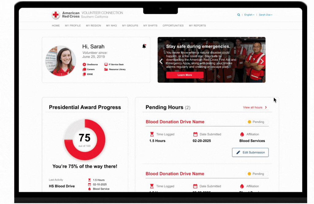
Presidential Award Progress Component
Pending Hours
Holistic Hours Log
Final Prototype
Hours Page

The Hours Page allows volunteers to log and track their hours. The four primary components include a presidential award progress tracker, a pending hours log, an overview of hours by affiliation, and a button to log new hours.
Main Updates to Homepage + Hours Page


Blood Donations Page
Recap — the Presidential Service Award is received by volunteers who dedicate 100 service hours towards ARC.
As part of our stakeholder feedback, a progress bar would be an effective means of showcasing volunteers' progression towards achieving the Presidential Service Award.
By implementing a circular progress bar that tells volunteers their percent towards award completion and insights on their last logged volunteer activity, volunteers will be better informed and motivated to increase their service impact.
During user testing, stakeholders mentioned many volunteers are misinformed on their progression towards achieving the Presidential Service Award because they cannot easily and readily see their breakdown of pending hours vs approved hours.
“Pending Hours” section aims to clarify which hours submitted are still under review, helping volunteers better understand their status.
In addition to pending hours, volunteers have a holistic log of all their hours, organized by affiliation (e.g., Blood Services Committee, Disaster Services Committee) for easier tracking.
For instance, if a volunteer is a member of the Blood Services Committee then all their volunteer work with that designated committee would be filtered into that running list.
This feature, carried over from lo-fi designs, was favored by stakeholders for its clear distinction between committee activities.

Find Blood Drive Page

Form to Create Blood Drive
